
I vibe coded a website for the first time using Claude/Sonnet 4.6. But first things first, what is vibe coding? It’s a way to speed up your workflow by prompting an AI assistant to build it for you. Building this myself would’ve taken me weeks since I’m not a hardcore web programmer but Claude just sped it up in 1-2 days.
I wanted it to be fun and cute and just for me. I didn’t want to think about monetizing it ’cause then it wouldn’t be fun anymore. So above are screenshots that I turned into an animated gif.
It’s basically a site where you can customize your pet. It’s an ode to my favorite game of all time, SuperPoke! Pets from MySpace days. It had the cutest graphics, pets, habitats and items and it was the first time I ever spent real money on virtual goods.
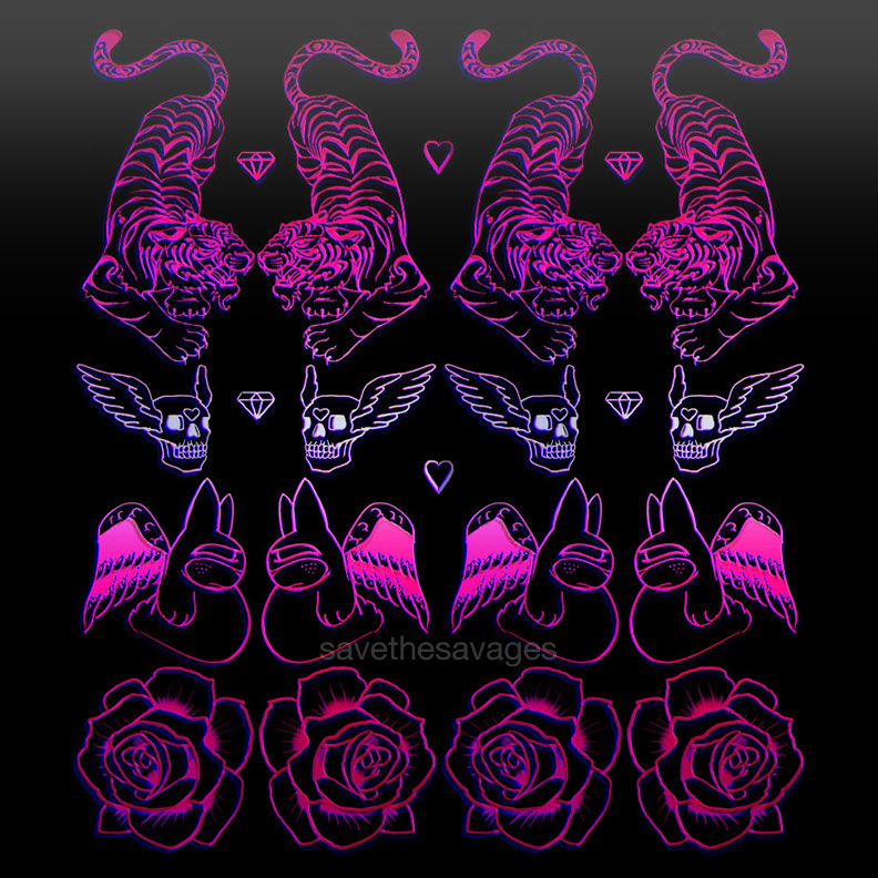
I managed to save a jpeg of my pet tiger Maru:

Anyways, the site is occultkawaiipets.com – it’s gonna be a work in progress!


